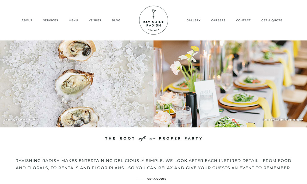
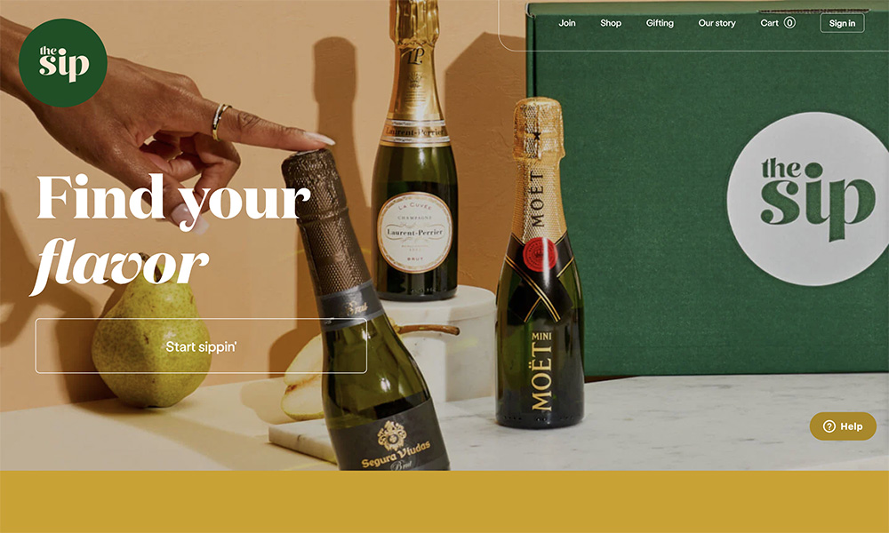
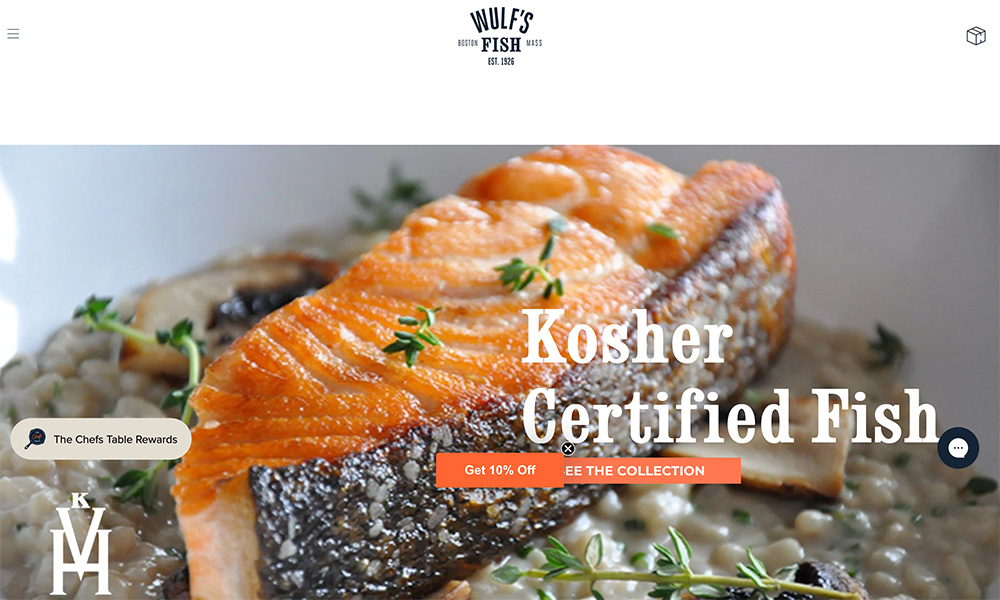
Wulf’s Fish

This is the website for a fish company called Wulf’s Fish.

What I Like

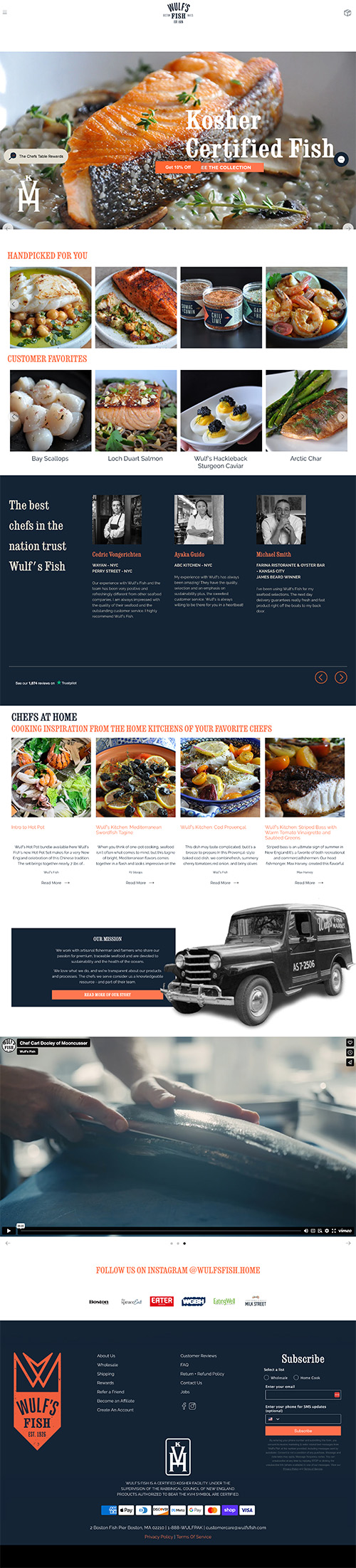
This is a great example of a clean website that manages to feel modern and do everything it needs to do.

It really leans into the brand by leaning on the color palette.

On a content note, I appreciate that it doesn’t only lead into a hard sell. It makes it easy for me to find and by products, but the homepage features a lot of social proof (recommendations by chefs) and recipes. It doesn’t just scream BUY BUY BUY.

What I'm Not Crazy About

I would make the sliding images in the hero a little bit smaller. I like the boldness, but there are a few problems. One is that some of the pictures appear a bit blurry (sometimes it’s because I’m mostly seeing the out-of-focus part). Also, that cuts off the headline and the initial CTA button. I wish I could see those without scrolling.

Other Designs

That Nailed It