
What I Like
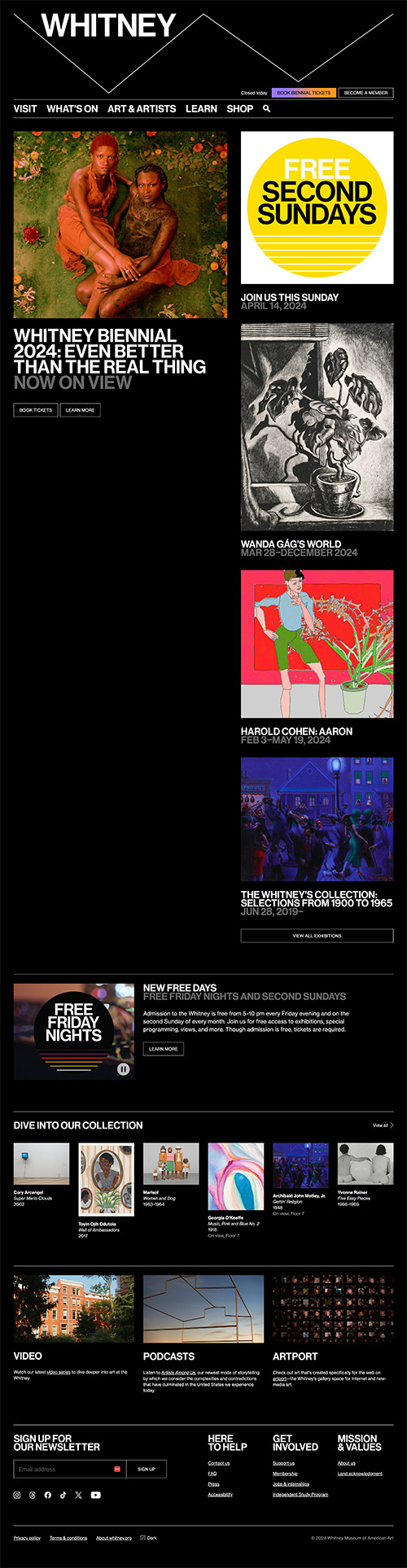
It feels trendy and modern, but the design elements are minimal enough that it highlights their exhibits.
I also really like that the different columns scroll at different speeds. This gives the motion to make the site feel alive, but it doesn’t give me the sea sickness that can accompany too many animations (which a lot of other sites are currently trying).
As a potential visitor, it’s nice to know that they took the time to make a nice website. This is another industry where the website is often overlooked (probably for budget reasons), but it’s my first touch point with the organization. I now have confidence that they’re worth a visit.