What I Like
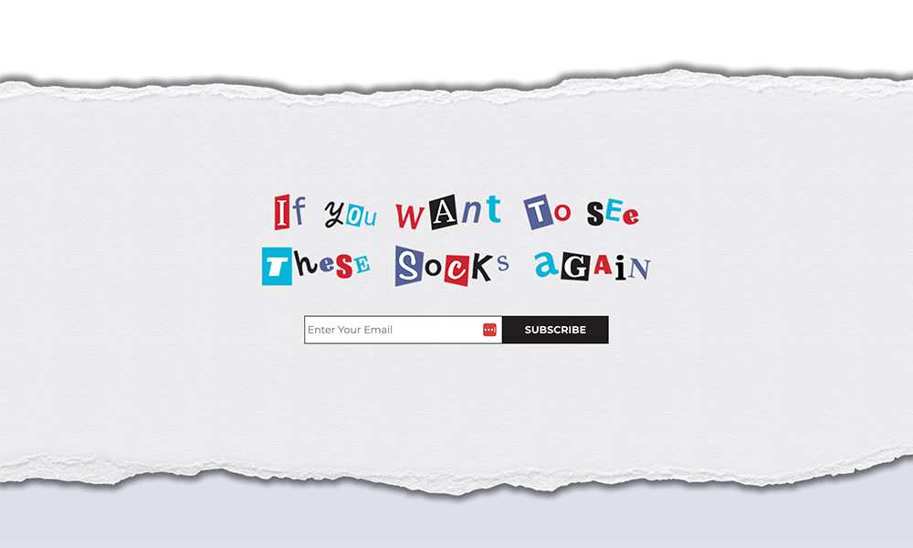
It’s fun and quirky, and it really gives me a strong sense of their brand. I really like that the hero section has a lot of text motion to make it feel alive, but I don’t get dizzy from too many other things moving.
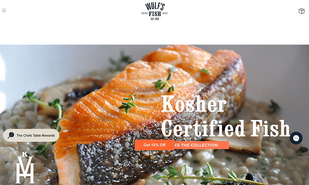
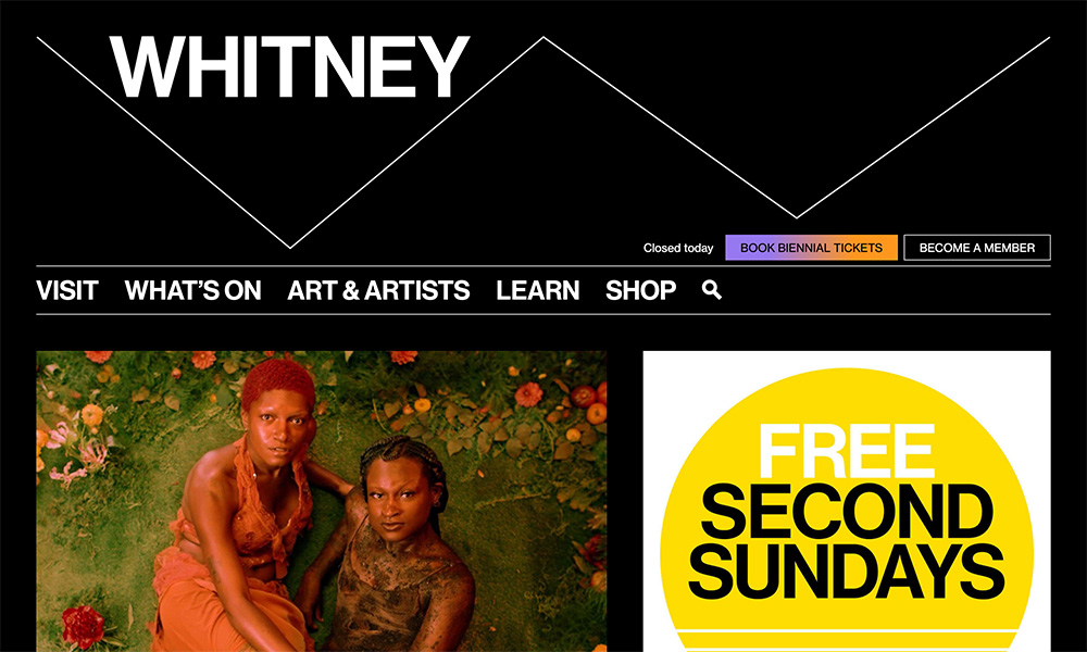
The unique typeface helps the brand stand out, and the large photos make me feel like I’m shopping in a physical store.
