What I Like
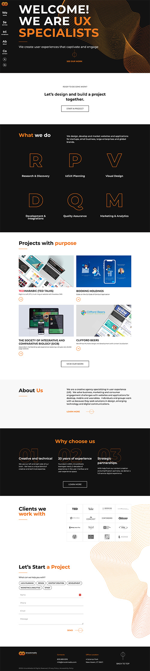
A few things really jump out. First, I like that I immediately know their brand colors, and I see them come back as I scroll through the site. A lot of agency sites focus so much on showing their work that they forget to solidify their brand to me.
The other thing that’s really cool is the nav bar being on the left side. I always worry about moving the nav bar from the top since it could cause confusion, but this is super intuitive.
I also like the mixture of dark and light backgrounds. Some sites really lean into a dark theme, but that can be a little depressing to scroll through.