What I Like
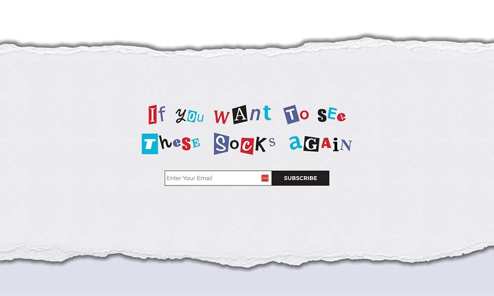
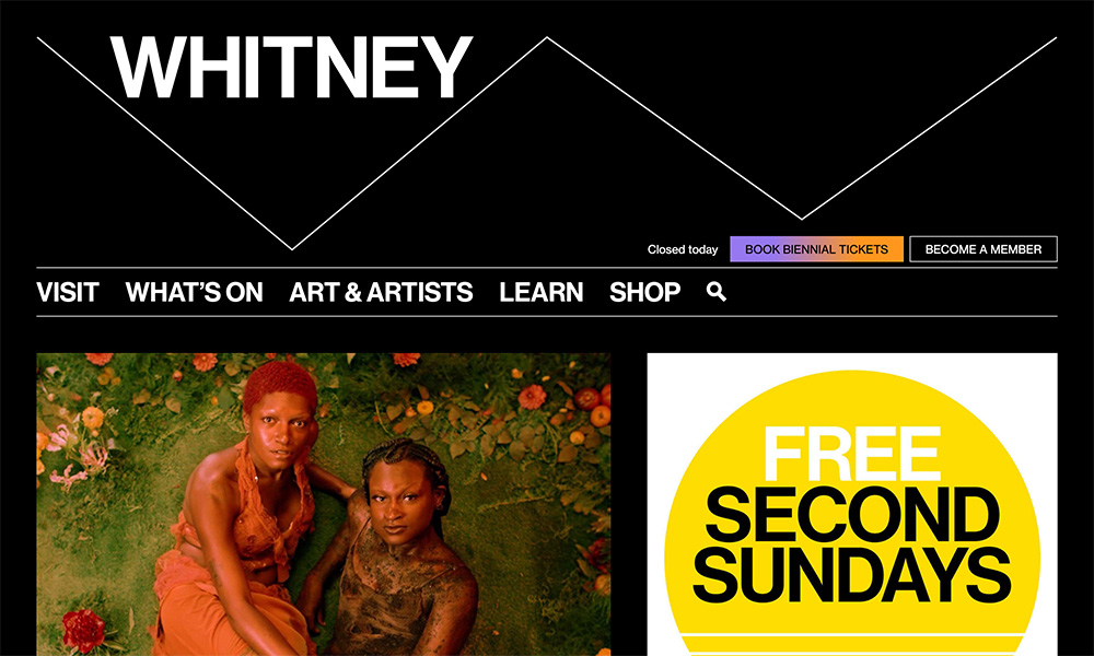
I like how this site uses more movement and design to seem much more elaborate than it is. The homepage is basically just a list of a few case studies, but it feels like there’s a lot more happening – in a good way.
It feels modern and unique. As a potential client, that gives me confidence that they can deliver something innovative for my brand.
And the site logo even rotates to the current brand of the case study! I haven’t seen that before, but it’s awesome.
