What I Like
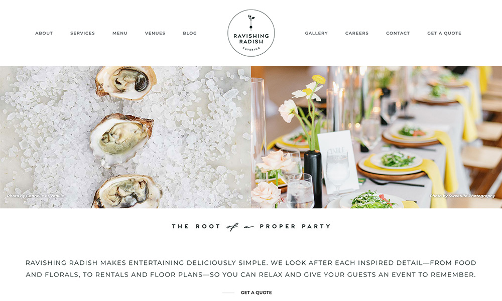
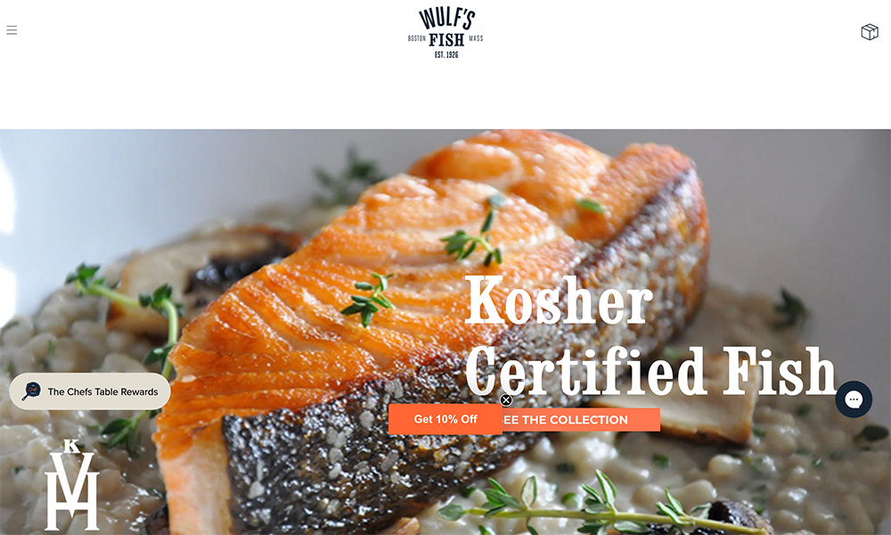
I like that it feels like much more than a basic site, but it doesn’t require much past good imagery and a solid color palette. This is a great example of showing more with less, and it doesn’t carry the noise or cheesy-ness of many other brewery sites.
Plus, the hero section really sets my first impression of any brewery site, and this is one of the few that takes advantage of that in a positive way. In other words, the hero is the label of your site.
