What I Like
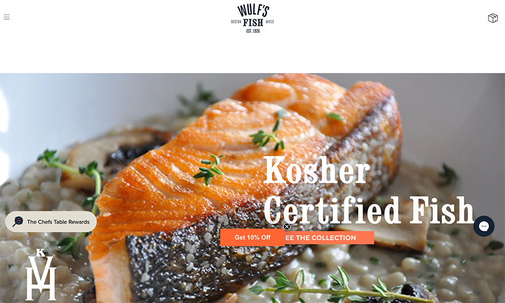
This site is simple, but that’s good because I like simple. It feels like the website version of a street food stand that focuses on doing their food right, and doesn’t worry about much else.
Many small restaurant businesses overdo their websites because they think something like this is too basic. But the problem with a highly stylized website is that you have to know what you’re doing, or it starts looking tacky very quickly. (But that isn’t to knock their skills – I couldn’t run a restaurant to save my life.)
On the homepage, I like how the name is literally front and center, there’s a big photo that exactly demonstrates what their value proposition is (not a distracting video!), and I’ll never get tired of black/white/yellow color palettes.
