What I Like
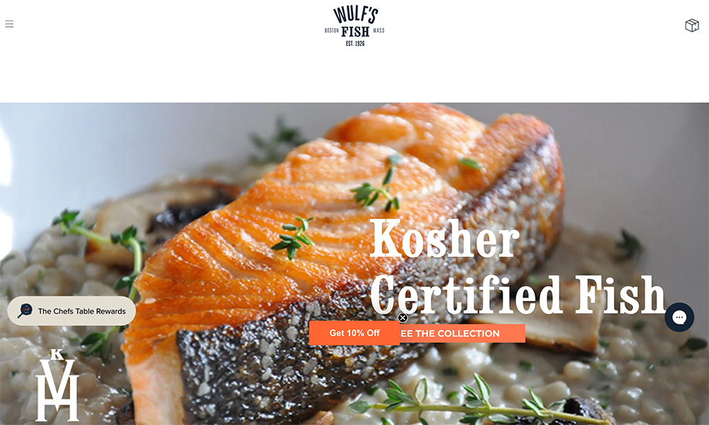
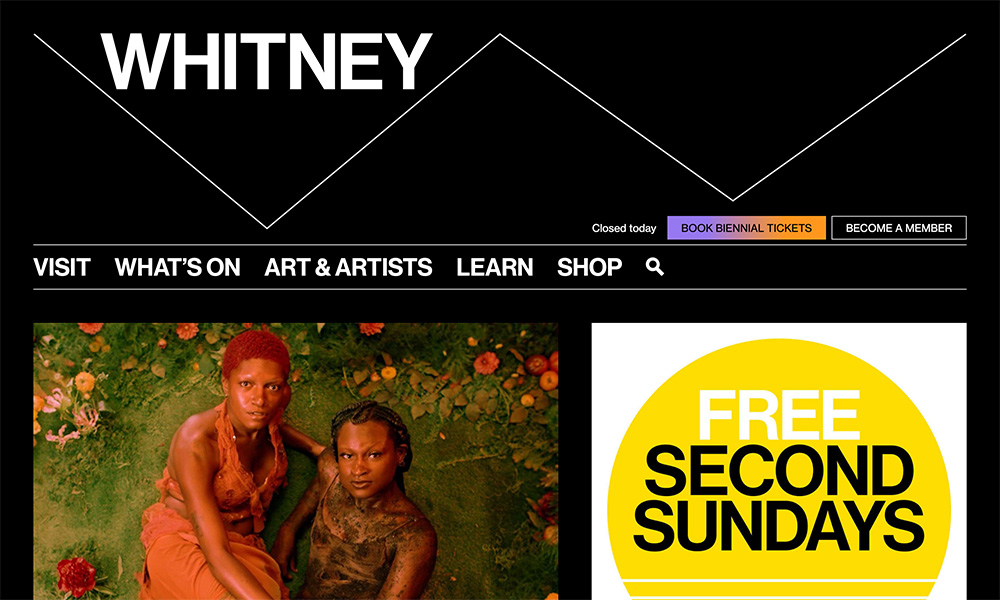
I love how basic and in-your-face the homepage is. The logo comes in with a nice animation, and then you have to click the menu icon to get anywhere. From there, it sticks with a minimal, clean theme.
This is a great example of how a site can have a strong brand with hardly any design elements. If you ever want to demonstrate the concept of “less is more,” this is a good site to pull up.
