What I Like
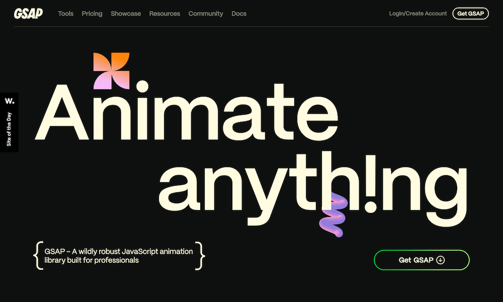
I really like that the GSAP site is clean and bold. It feels modern and maintained, which is important for tech libraries. No one wants to use one that’s old and broken.
It’s very active, but not overdone. The homepage has one horizontal scroll that slightly disrupts my scrolling flow, but the rest of the animations are relatively minor (especially considering the product).
Probably the best part is that it literally demonstrates its product from the moment you log on to the page. Never overlook the fact that your website is your first touchpoint to many potential customers.


