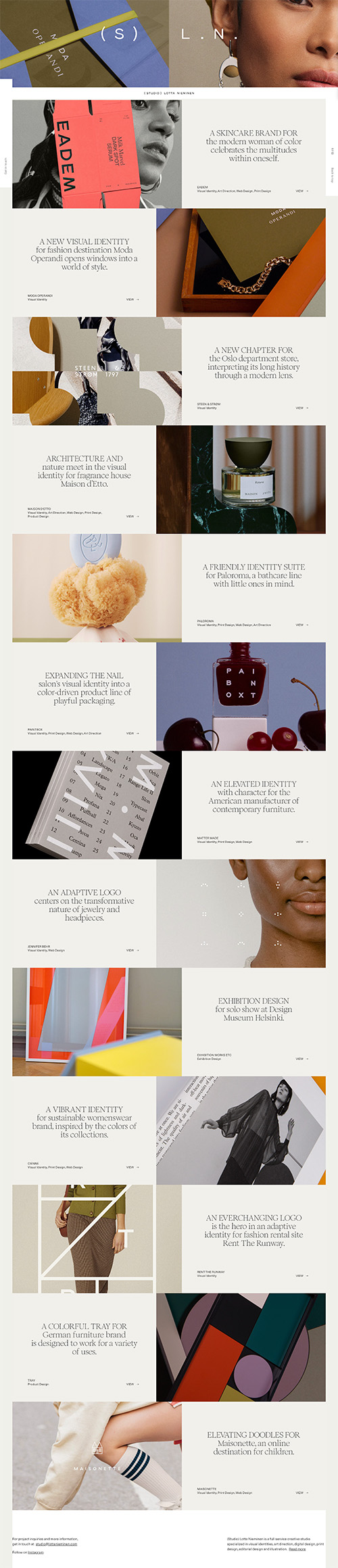

What I Like
The bold use of giant photos really shows off the portfolio. If you arrived here expecting to see work samples, then you will have wasted 0 seconds.
Also, the navigation tools are on the two sides of the page, so they are always there – even when you don’t quite realize it. It’s an extra bonus that they tell you how many sections you’ve been through. The whole setup makes it feel like a magazine.