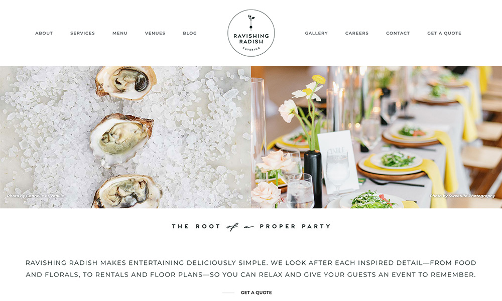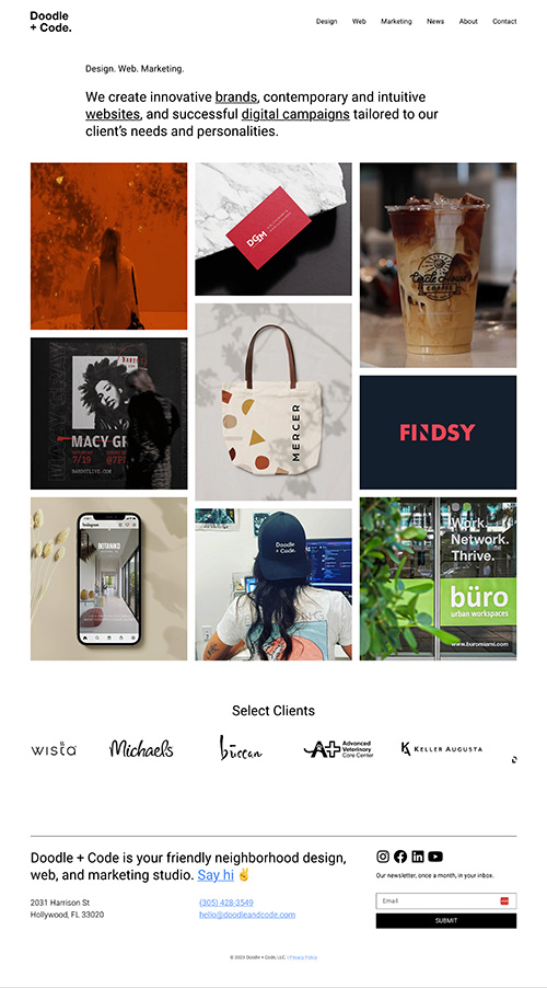
What I Like
It’s very clean and to the point. The visual hierarchy is almost in a reverse order of what I’d expect, with the shorter headline being smaller text. But my eyes first jump to the pictures, and then slowly work back to realize the services they offer.
I also like that the homepage has a variety of images (and client names), which gives me confidence they can handle a lot of different things.