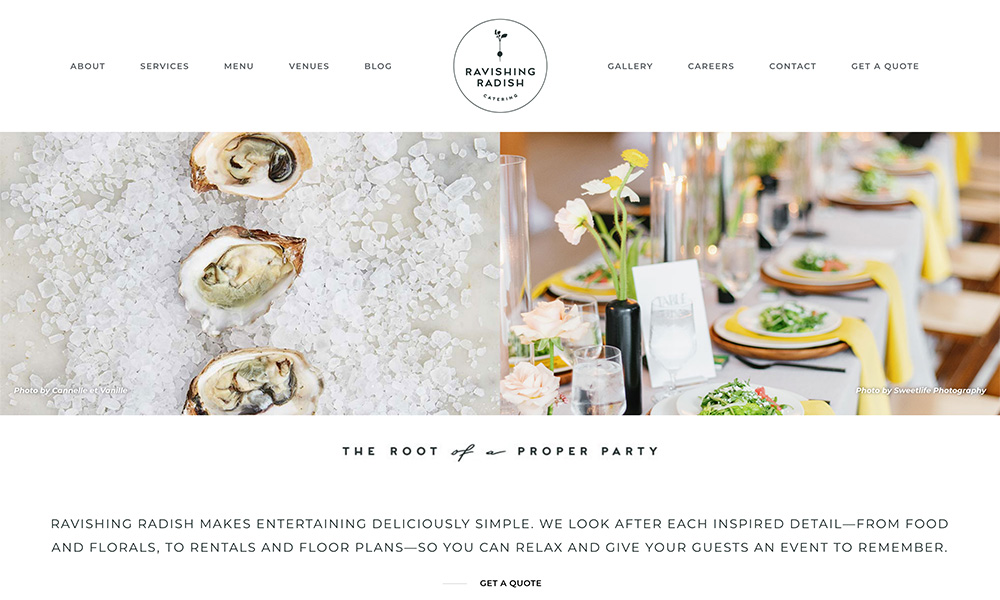

What I Like
This design isn’t as spectacular as some of the others I feature, but don’t let that fool you. It’s a great example of a simple design that still conveys a strong brand.
They were wise to skip using a pure white background, and I can really feel the color palette throughout the site. I also appreciate how the graphics were tastefully used.