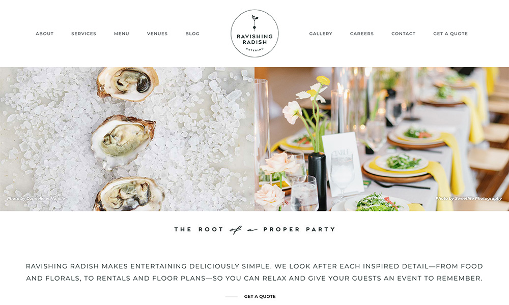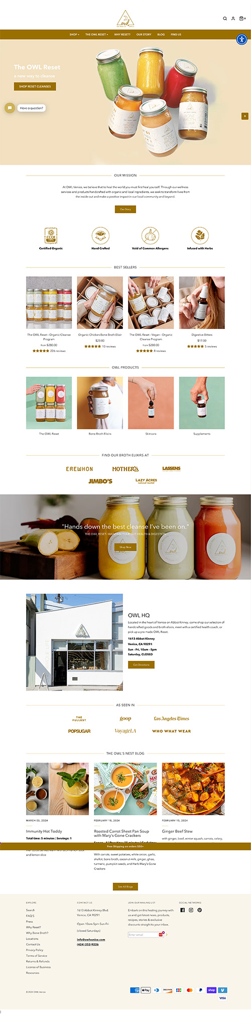
What I Like
This site stood out to me because it is simple and clean, but does a great job of using color to maintain a distinct brand. It’s a great example of using a relatively standard site structure/style, and making it feel unique.
I also really appreciate the photos all having a similar feel.