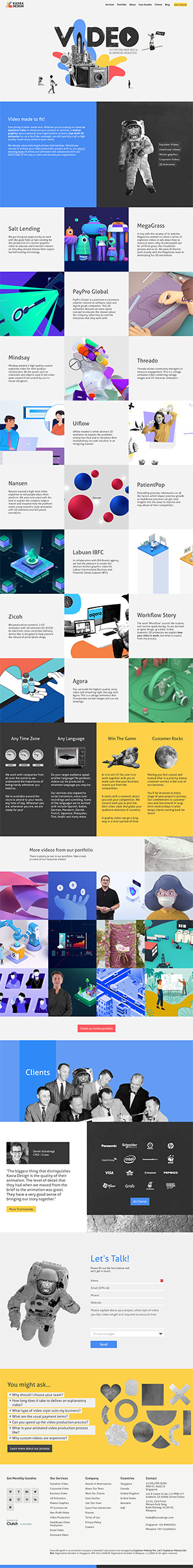
Kasra Design

This is the website for an video animation company called Kasra Design.

What I Like

It’s simple and minimal, but also uses bold colors and big shapes. I particularly like the retro space-age theme, and how that contrasts with the portfolio of modern explainer videos.

I also appreciate that the site has motion built in, but it isn’t overdone. It strikes the right balance of feeling alive without being too intense.

What I'm Not Crazy About

The content design is a little hard too take in. Using the homepage as an example, there are rows and rows of 3 squares that go the full width of a desktop screen. It gives me the impression that they have a lot of experience (which is good), but it also overloads my brain (which isn’t good).

Other Designs

That Nailed It